Hi! I like designing things. Right now, I'm doing that Stripe.
DMs | 2019 - 2020
Cross-functional partnership Team process Execution
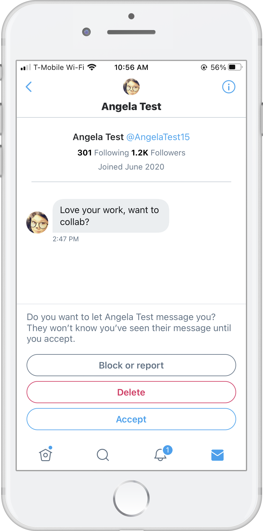
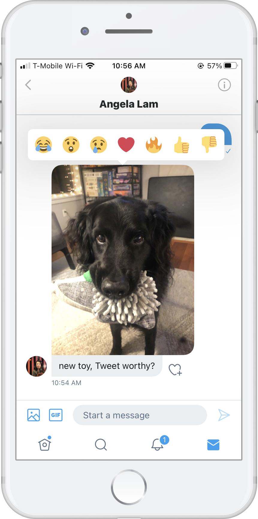
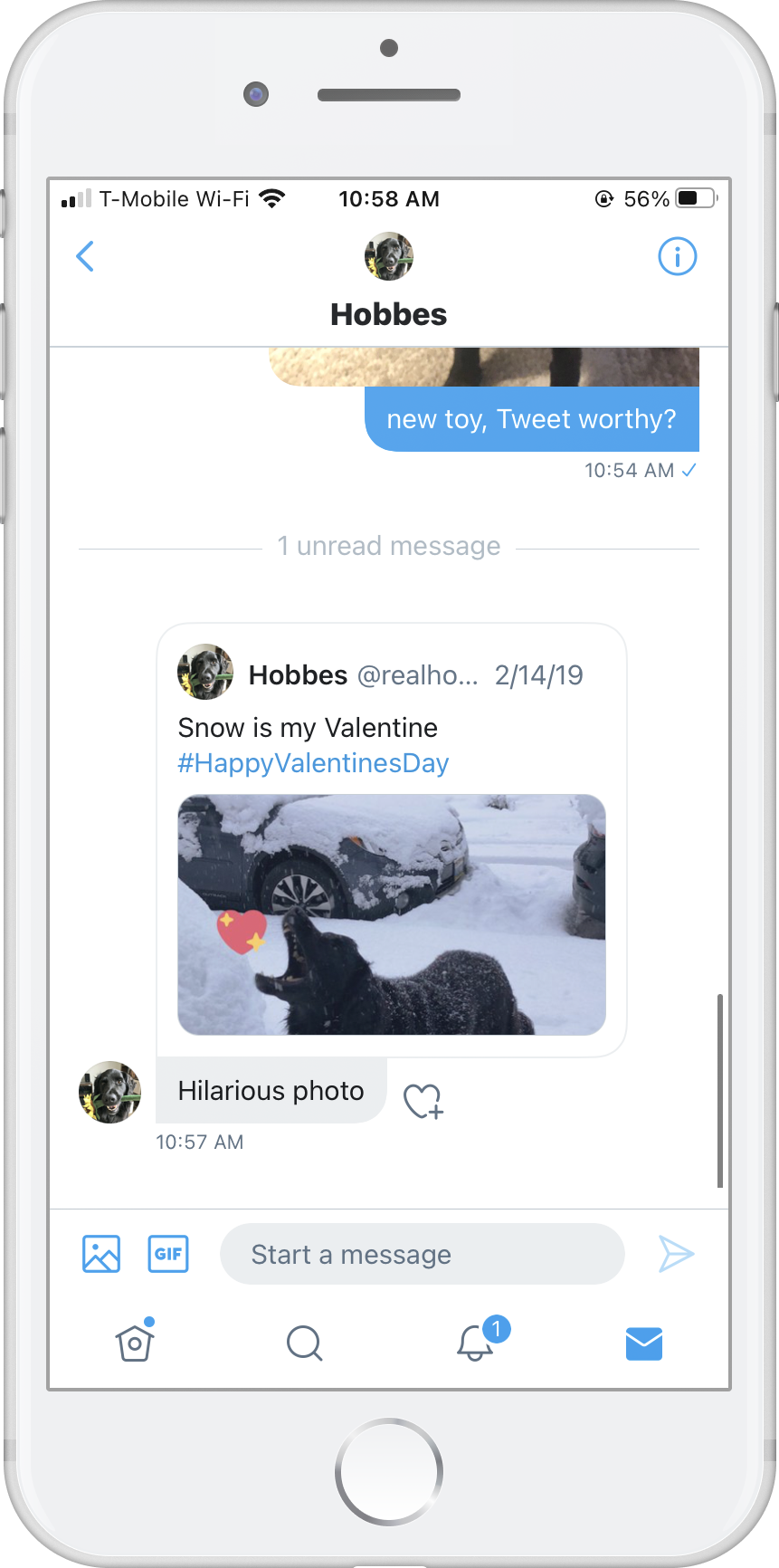
Help customers make new connections privately and help them feel like they belong on Twitter. Create a safe space to build relationships and participate in healthy conversations.
I partnered with my PM, client EM, backend EM, and researcher as a design lead. As our team formed, I facilitated workshops, participated in foundational research to uncover customer problems, helped develop roadmaps, and built relationships with other teams. I worked closely with client and backend engineers to leverage the Twitter design system in defining, building, and shipping features.
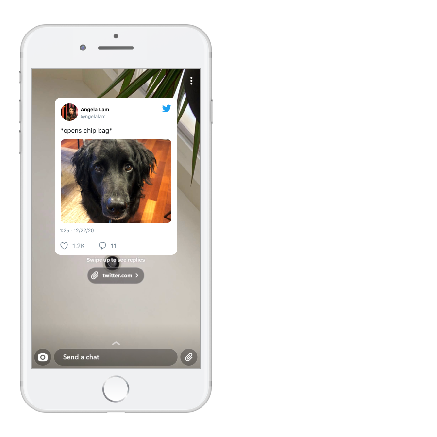
My partners are encouraged to reach out often with questions, ideas, concerns, nothing is too small or simple. I'll illustrate our ideas to discover and talk tradeoffs, it's easier than trying to imagine experiences in our heads 🧠. Here's a bit of a sketch used to kickstart conversations about improvements we could make to the Twitter DM ecosystem.
I tailor my design documentation to the team's needs. We worked across iOS, Android, and Web at the same time, so it was helpful to see specs in the same place to compare experiences and make platform-specific tradeoffs. It was also helpful to see experiments and milestones laid out in the same file so engineers could see how components evolved over time and optimize their work towards future iterations.
Together as a cross-functional team, we:
Cross-platform collaboration Design systems
Our goal was to make it easier for customers to share Tweets with people who are already gathered on other platforms and help recipients of that content learn more about it. Our hypothesis — if sharing is easier, more people will share and more people might find value in coming to Twitter.
I initially started this project as a Staff Product Designer IC partnering with product, research, and client engineers. Later in the project, I partnered with a designer on my team who I managed, and we finished the work together. This was my first experience in management and I learned a lot! I'll tell that story a different time.
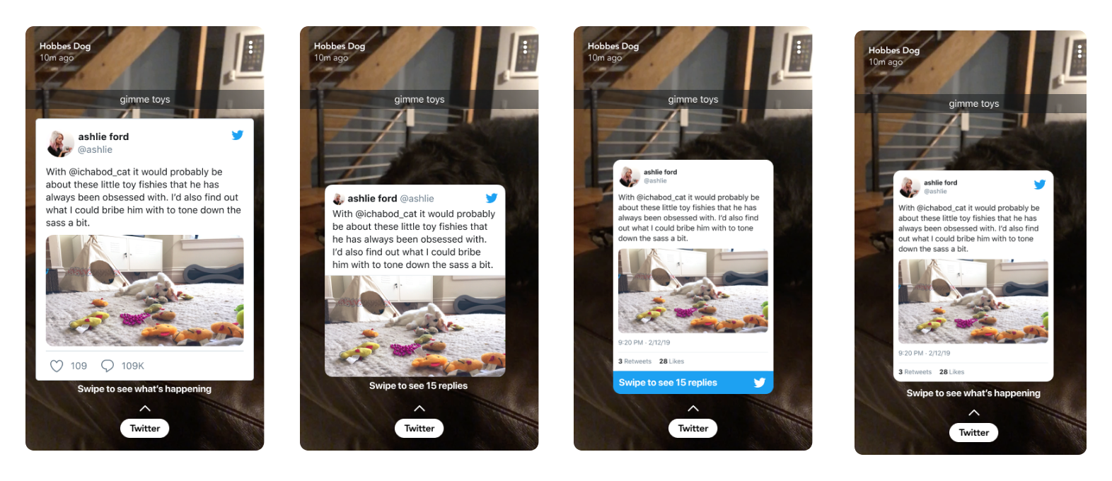
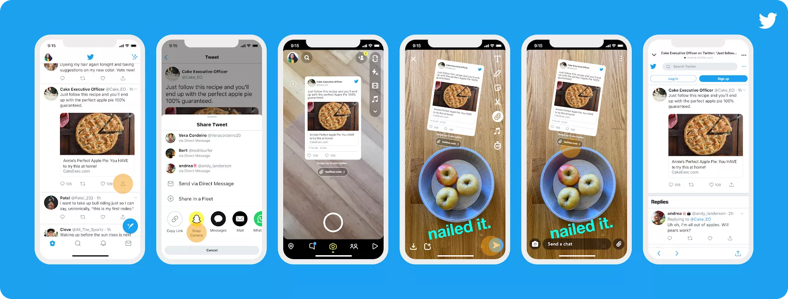
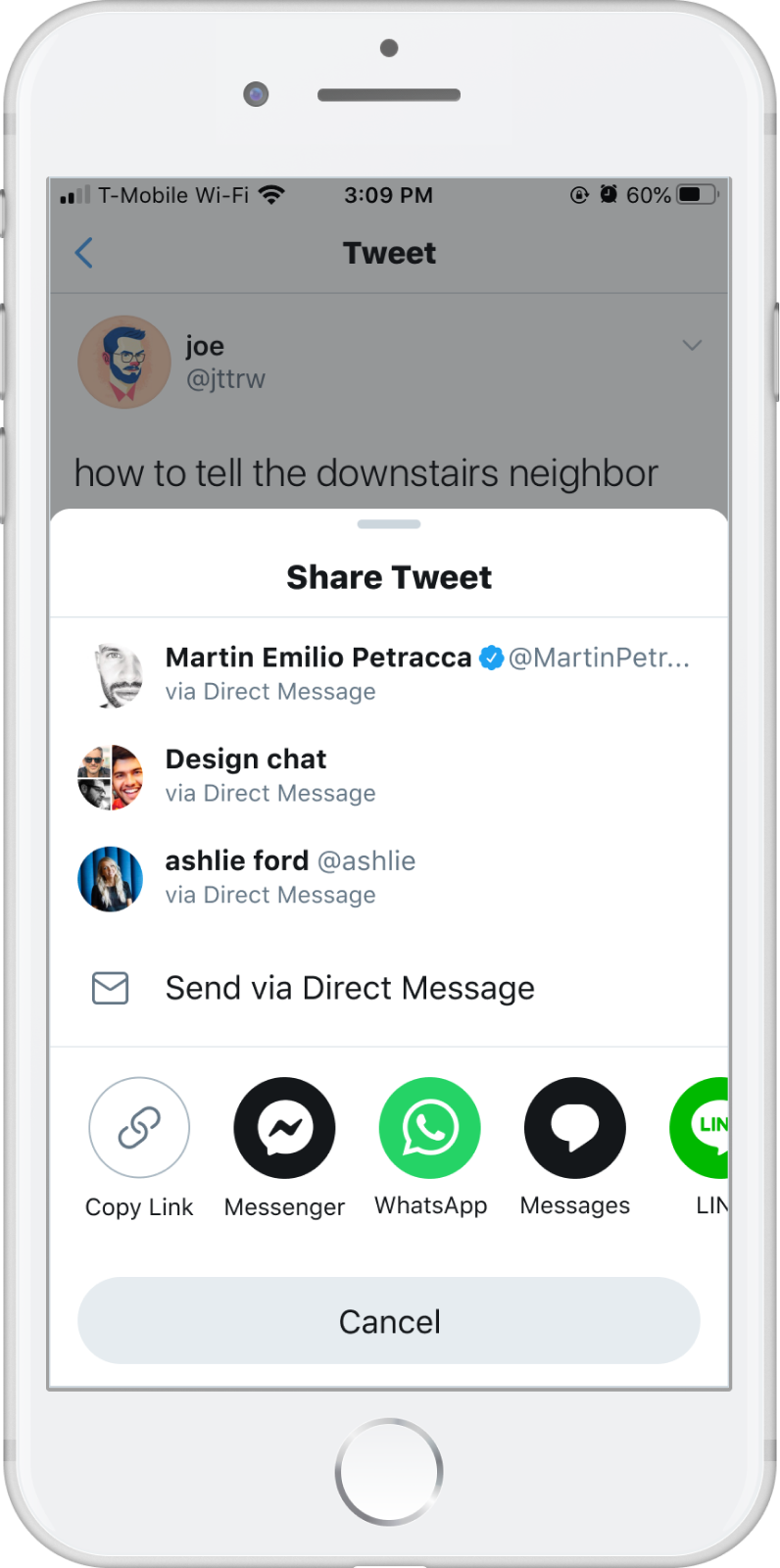
The first thing I tackled was how to get a Tweet from Twitter into another. Some customers crop screenshots of Tweets and share the image, some copy a link or share using native share UI. It takes two taps to get from the Share button to the native share UI. How might we elevate the apps that customers often share Tweets to?
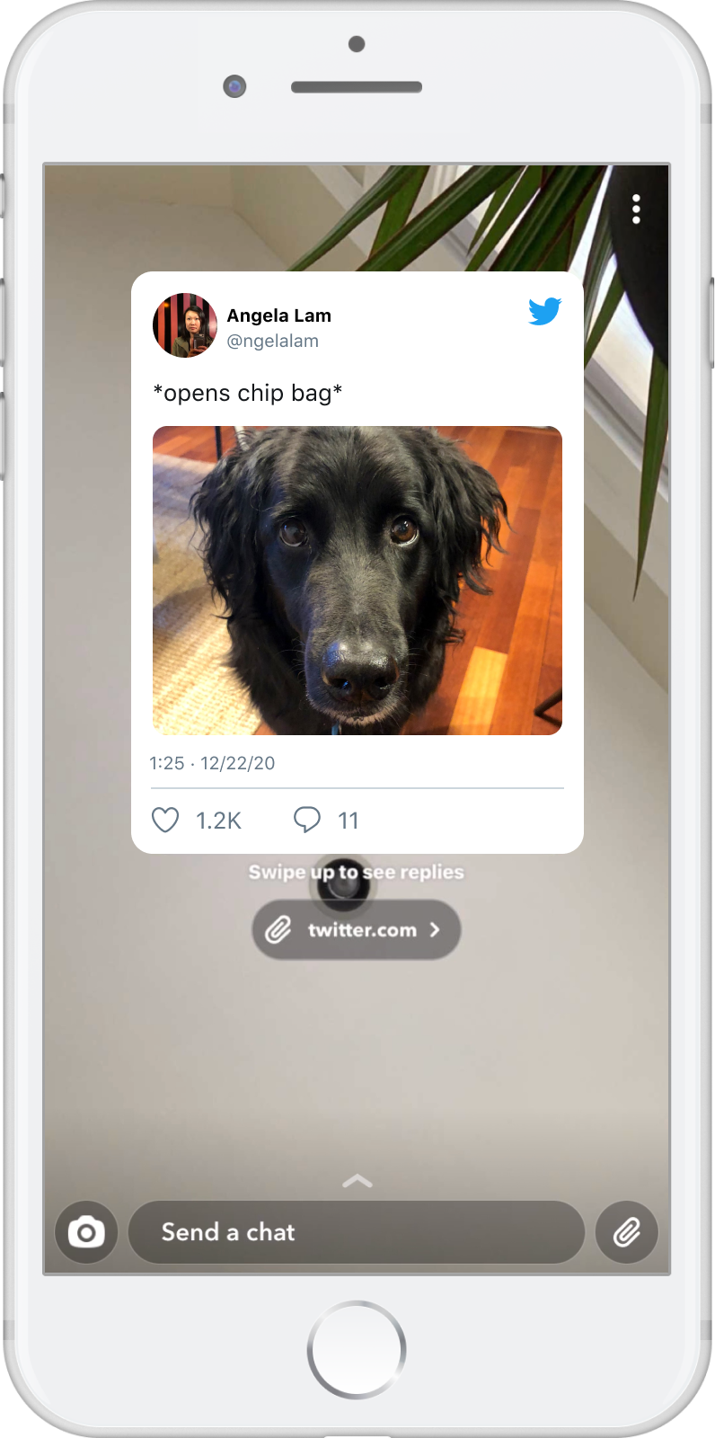
Then, I considered how that shared Tweet might render in other apps in a way customers expect and that feels "moveable" to enable content creation around it. On the Sharee side, I also needed to consider how they can view the content and learn more about it. Both views of this "Tweet sticker" should look the same so the Sharer has control over how they create their content.
We took these directions through research and learned customers preferred the app carousel, especially if it reordered based on usage or if they could customize it, and Tweet stickers that had Like and Reply counts and less Twitter blue.
The first iteration of our solution is below. I created a design system for app icon assets based on apps' brand guidelines to minimize visual variance across icons and future changes.
Learn more: Article
Events | 2017 - 2019
Design vision Strategy Cross-team partnership
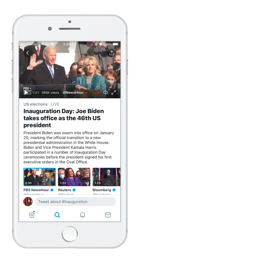
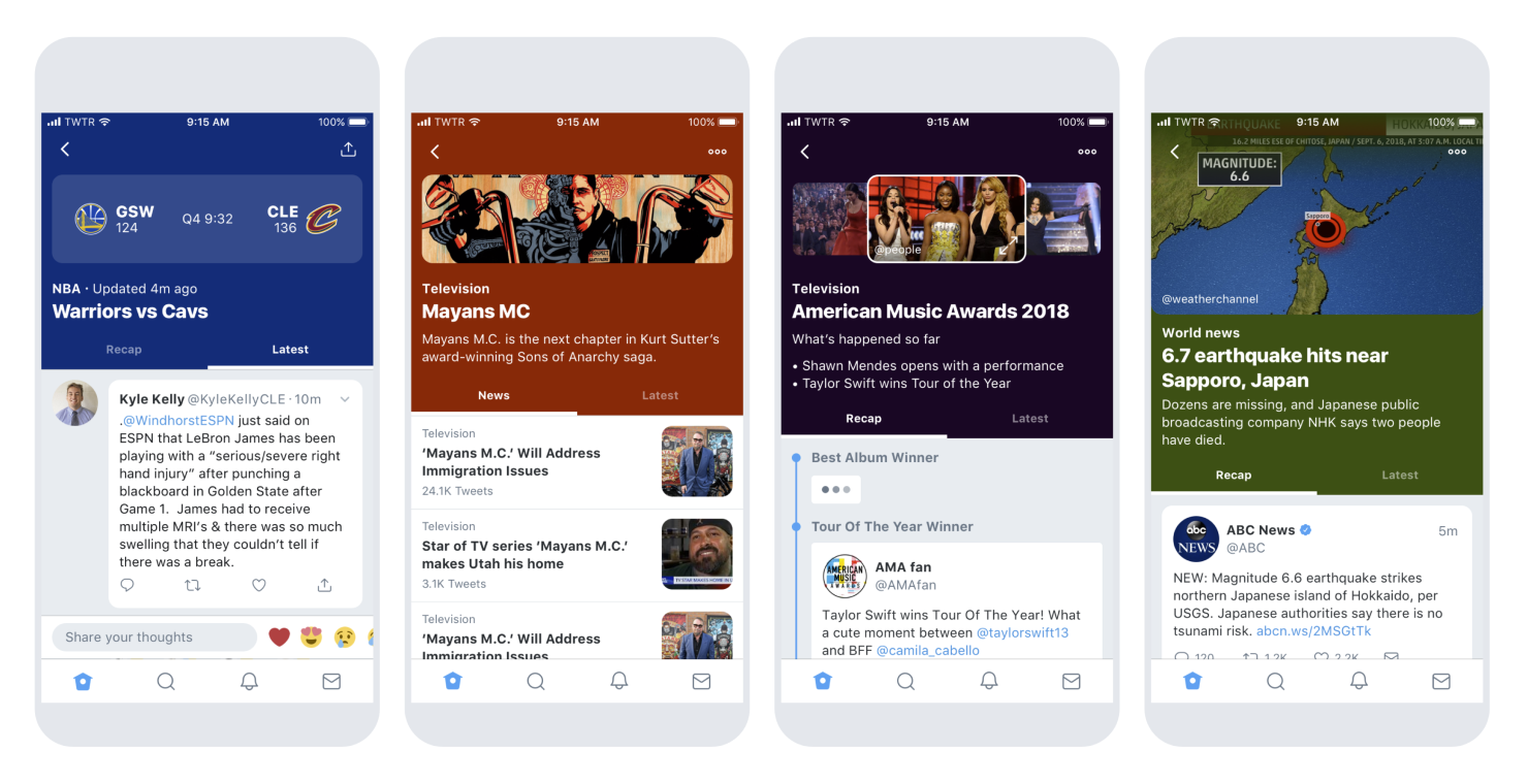
When you want to see if everyone else felt that earthquake or see hot takes on the game last night you might struggle to find just the right hashtags or accounts on Twitter. It's hard to find out what's happening on Twitter, we wanted to make it as easy as looking out the window.
Early in the project, I was a Senior Product Designer collaborating with two other designers and a researcher to understand the customer and the products they hire to help them find breaking news and events on Twitter.
People came to Twitter when something was happening in the world. When they arrived on the platform, they had to comb through Home, Trends, Moments, Search and videos streams to find relevant information. How might we make the conversation easier to find and consumable in one place?
After the discovery phase, I led design with support from another designer and collaborated with designers who owned the various products and surface areas we needed to touch. We partnered with two primary PMs (plus researchers, Curation, Comms, and internal tooling) to bring together Tweet sources around an event or topic into one page and pointed all our discovery mechanisms there.
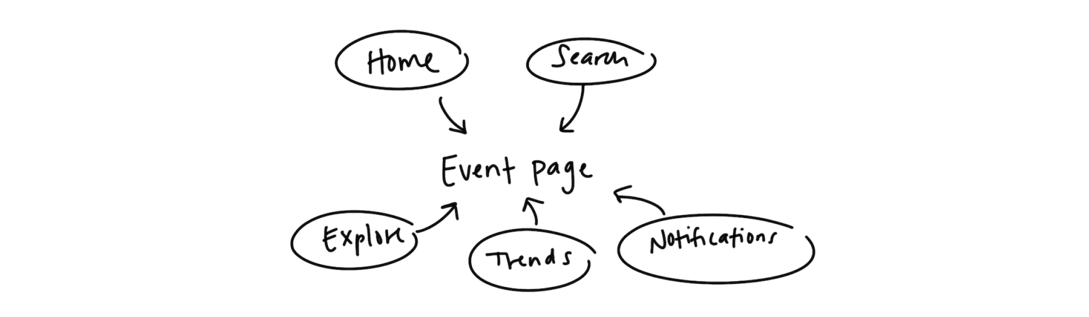
No matter which discovery surface area you chose, Home, Explore, Search, Notifications or Tweets, we would bring you to the same page. Creating one space for the conversation also made it easier to share!
We created a system of components that allowed curators to update an event page over time depending on the state and needs of the situation. If there was on-the-ground footage, we showcase the video. If there is misinformation, we show annotations to fact check and educate.
My vision was to add more components to help customers keep up with live events like games and award shows, or long-running events like TV series or election seasons, and help curators tell better stories.
None of this works without our team of curators and they needed some ❤️. To make their lives easier, I did some internal research to learn about the tools they use and uncover pain points in their work flow. With these insights, I helped redesign their internal tools and dashboards.
Learn more: Twitter blog post
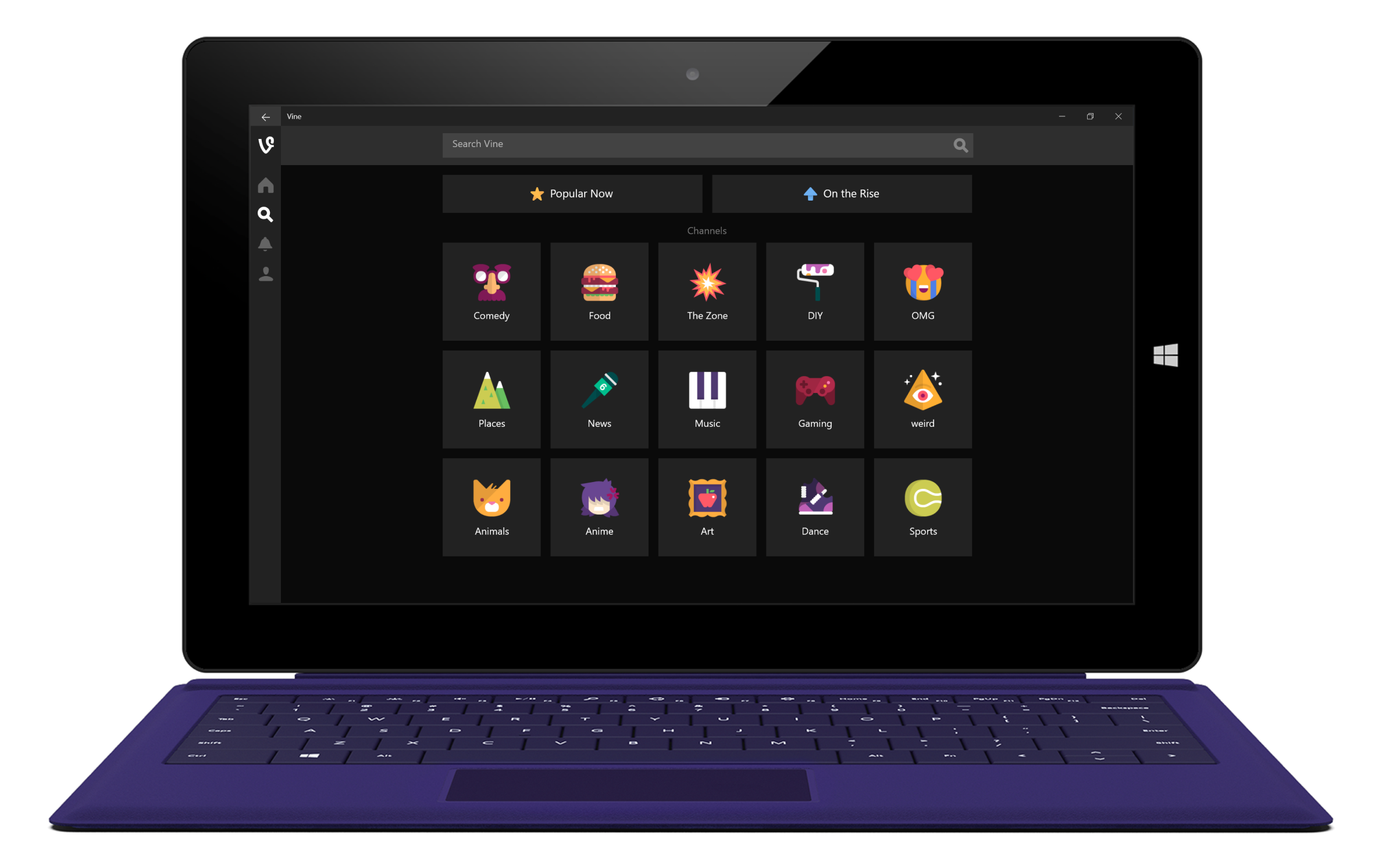
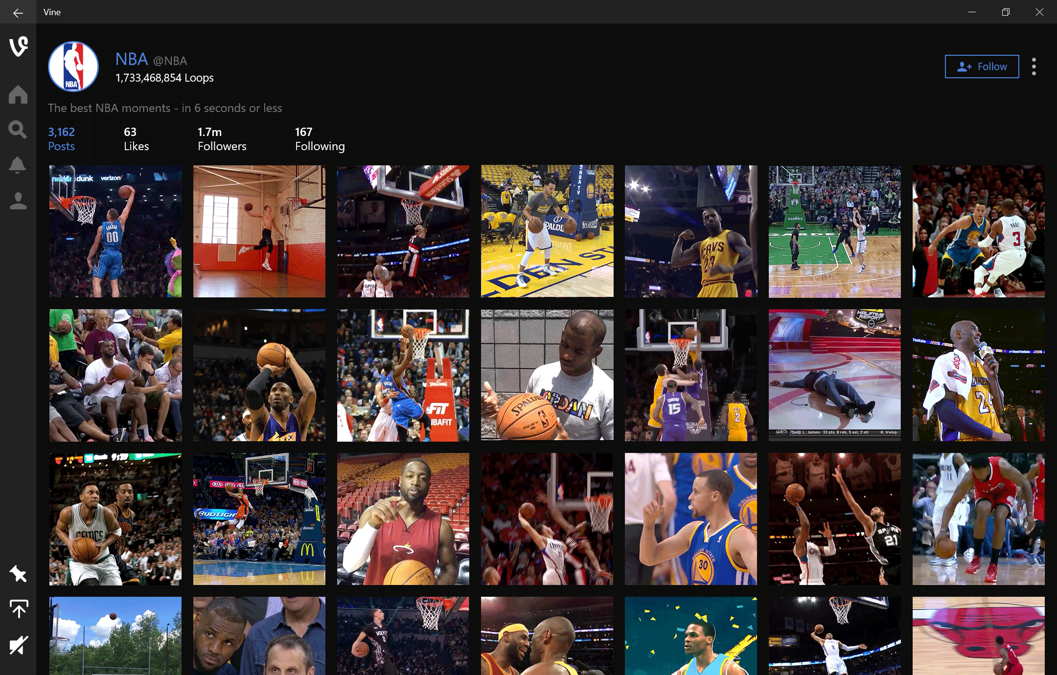
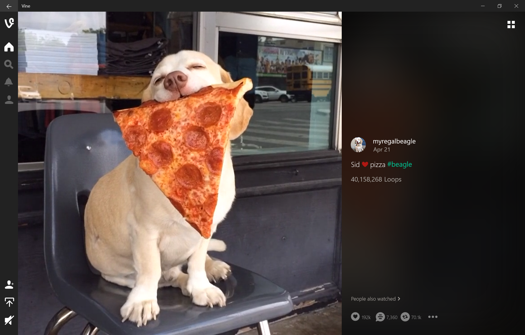
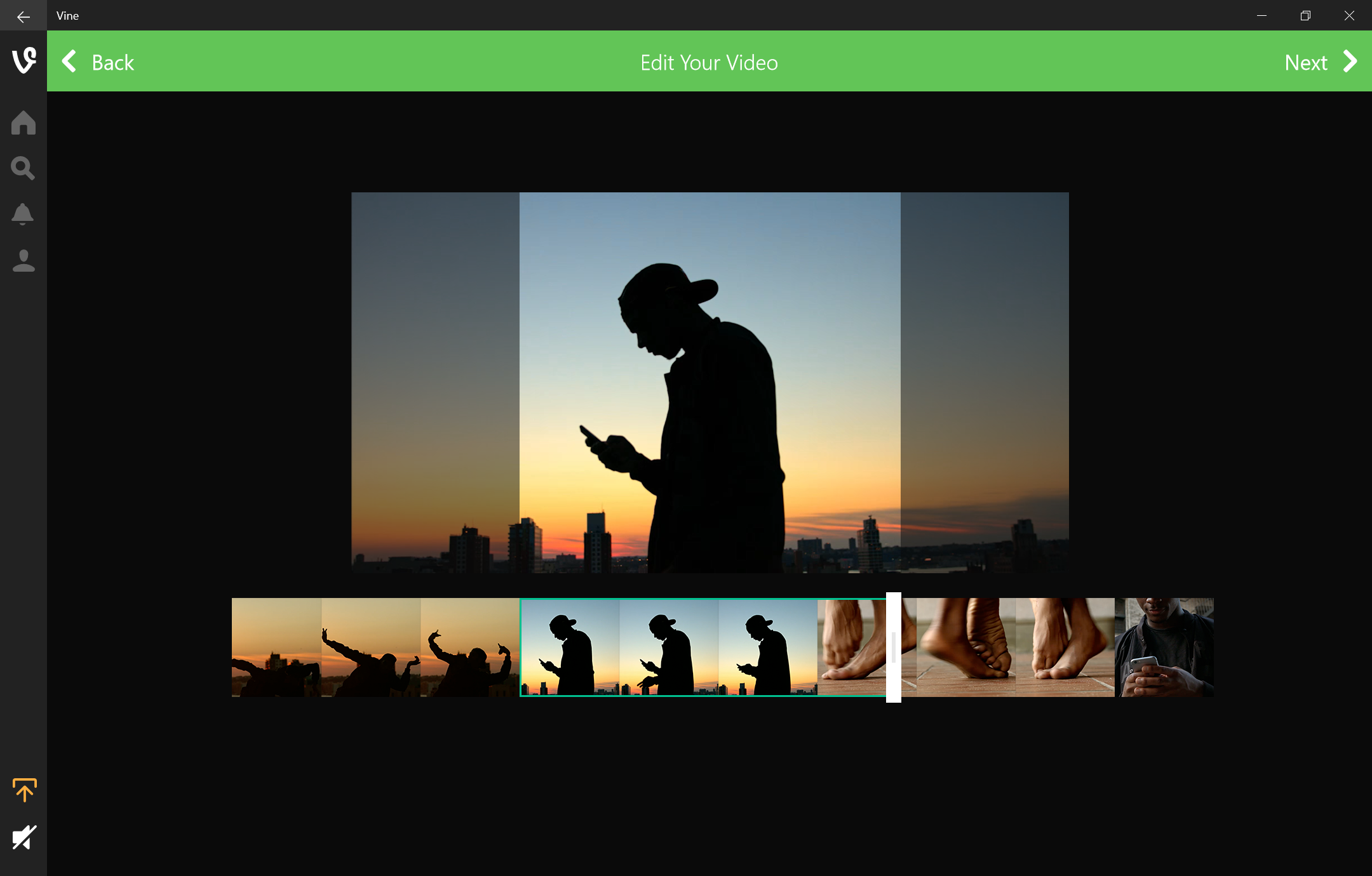
Vine on Windows 10 Desktop | 2015 - 2016
Cross-platform consistency Prototyping Execution
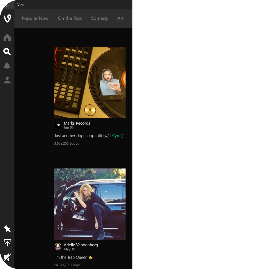
Bring Vine and the 6 second videos that everyone knew and loved to Windows 10 desktop and reimagine it as a lean-back, mouse and keyboard experience.
As an IC designer on the Twitter side of things, I collaborated with the Vine creative director and a Vine designer to understand the ecosystem and all the features available on mobile devices (their primary experience), mapped and tailored them to a desktop experience, and worked with engineers to build it.
On a mobile screen, each video gets its own time in the spotlight and it’s easy to swipe up to move onto the next one. On desktop, we had to consider a few things - 1) with so much available screen real estate, customers expect to see more content presented to them so they can choose where they want to start and 2) scrolling long distances is more cumbersome with a trackpad or mouse wheel but mouse input allows for more fine-grained clip editing.
Prototyping for this project was done in Framer.
Learn more: Article
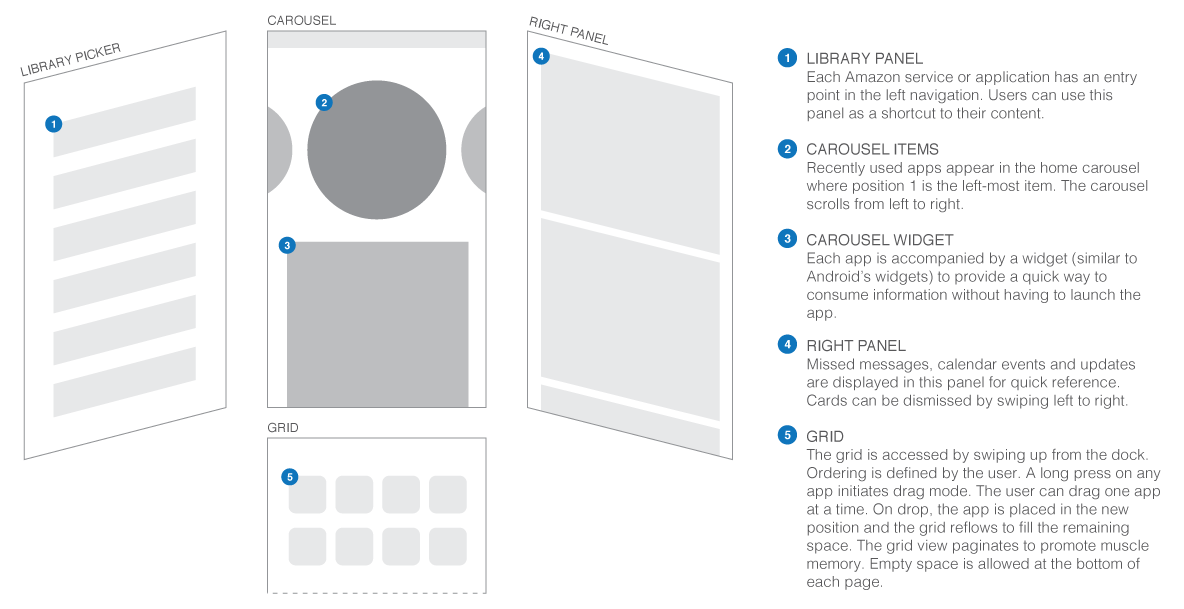
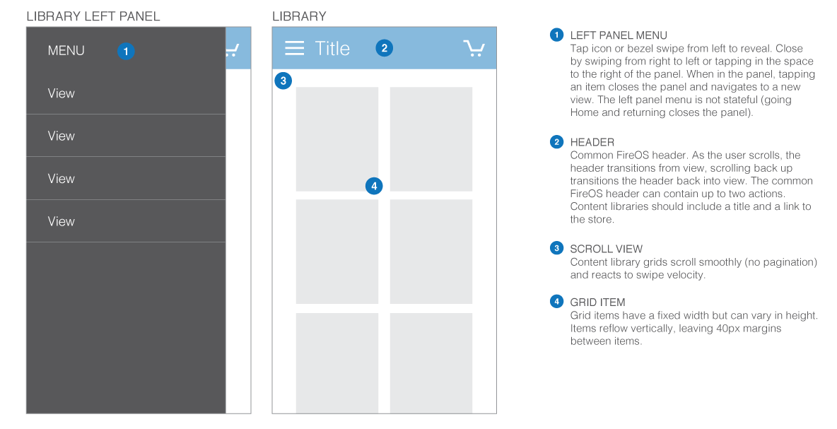
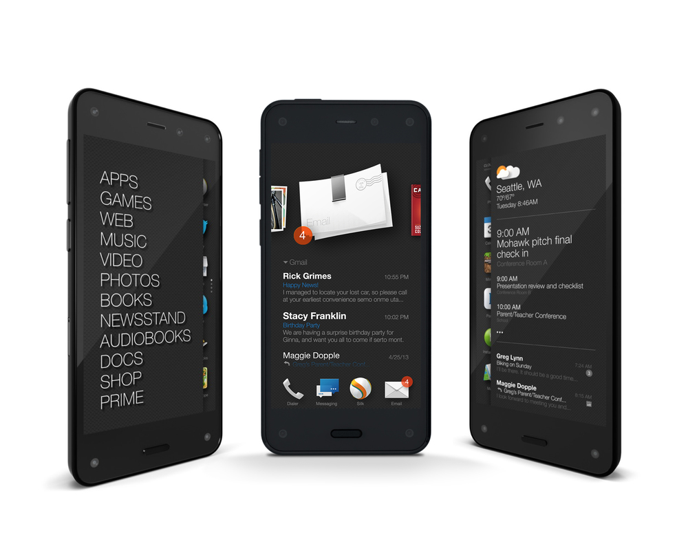
Fire Phone | 2013 - 2015
Mobile OS Framework
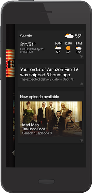
The Fire Phone is a smartphone designed and developed by Amazon.com. It was announced in June 2014, and runs FireOS, a custom operating system forked from Android. Being late to the smartphone party, a cookie-cutter smartphone wasn't an option. Our goal was to provide customers an entirely unique mobile experience, while highlighting the Amazon services people know and love.
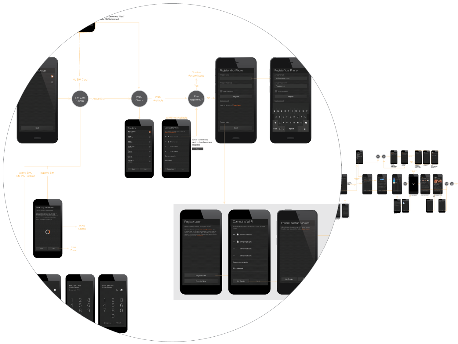
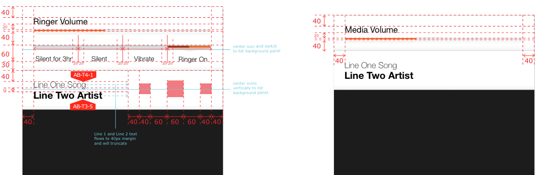
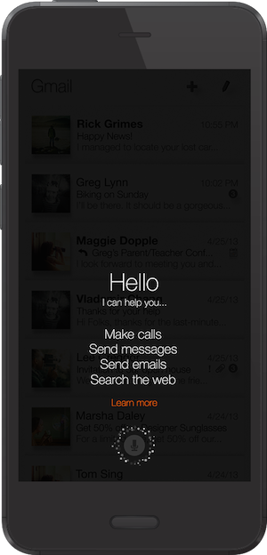
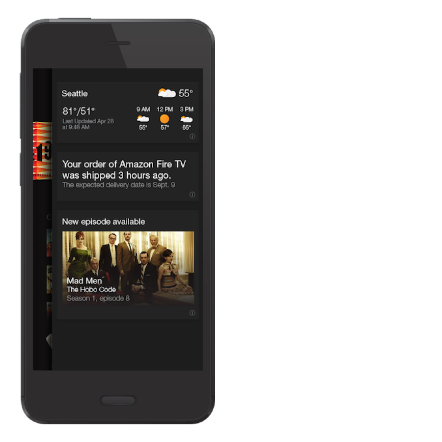
I was part of a small IxD team that designed the phone's framework. That's basically everything you wouldn't call an "app": the home screen, the lock screen, search, settings, gestures, voice controls, volume and media transport controls, and a whole lot of other stuff that customers rarely see but would certainly miss.
We partnered with product management to identify customer needs, develop tenets or principles, and generate requirements to guide design decisions. I drew user flows and wireframes to communicate ideas to stakeholders across the company, from product managers, to developers, and executives. I got their feedback, iterated, got more feedback, rinse and repeat. I applied our visual skin to the designs, redlined them, cut assets, and worked elbow-to-elbow with developers to make sure the code matched the vision.